What is App Engagement? A Design Guide to Boost Retention
App Engagement Collage illustration by Matteo Della Chiesa
Running a mobile, desktop, or web-based app requires careful attention to how users engage with your product. Simply creating an app isn't enough anymore. You need to measure how often users interact so you can maintain engagement as you grow your business.
Luckily, understanding and measuring user conversion rate or long-term app engagement isn't rocket science. In most cases, it's relatively easy because there are built-in or free tools to track specific user metrics.
But instead of focusing on the marketing tactics you'll receive from most app engagement guides, we will take a different approach. We'll focus on the power of design and UX (user experience) to create highly immersive and rich user experiences.
Here's everything we'll talk about in this guide:
What is App Engagement?
App engagement is a comprehensive measurement that determines the level of interaction between a user and your app. Engagement metrics measure whether users actively use your product, when they choose to engage, how often, and which app features they find most valuable.
Why is App Engagement Important?
The simple reason you want to measure app engagement with any number of users is to build loyalty. The better the app, the more likely people will return to engage, rely on its features, and suggest it to friends and family.
With proper engagement, business owners can:
Reduce the churn rate (i.e., the number of people who abandon your app)
Improve retention rate
Increase revenue from existing customers (sometimes called users spend)
However, tracking or measuring the same app engagement metrics is optional for your product.
For instance, knowing how users navigate and interact with your e-commerce apps, like Amazon or Temu, will provide insightful data. Getting users to return and stay longer on your app will result in more sales and, therefore, more revenue for your business.
The same core concept applies to apps that rely on ads as an income source. Social media platforms like TikTok are an excellent example. They are one of the fastest-growing platforms, with over a billion monthly users, thanks to the "stickiness" of the content, resulting in above-average app engagement time.
In contrast, other apps like Spotify or Apple Music couldn't care less about how long a user looks at the screen. Most of their content is audio, working in the background with mobile marketing to determine session length. They leverage these data points to determine user preferences, optimizing user experience. However, considering the strategic parity between the two companies, How did Spotify win the streaming battle against Apple Music despite its brand disadvantage?
With one word – Personalization.
Nobody, literally (not really), would try to take on the brand juggernaut that is Apple and win at their own game unless you can grow so big that there is no denying the value of your competitive product.
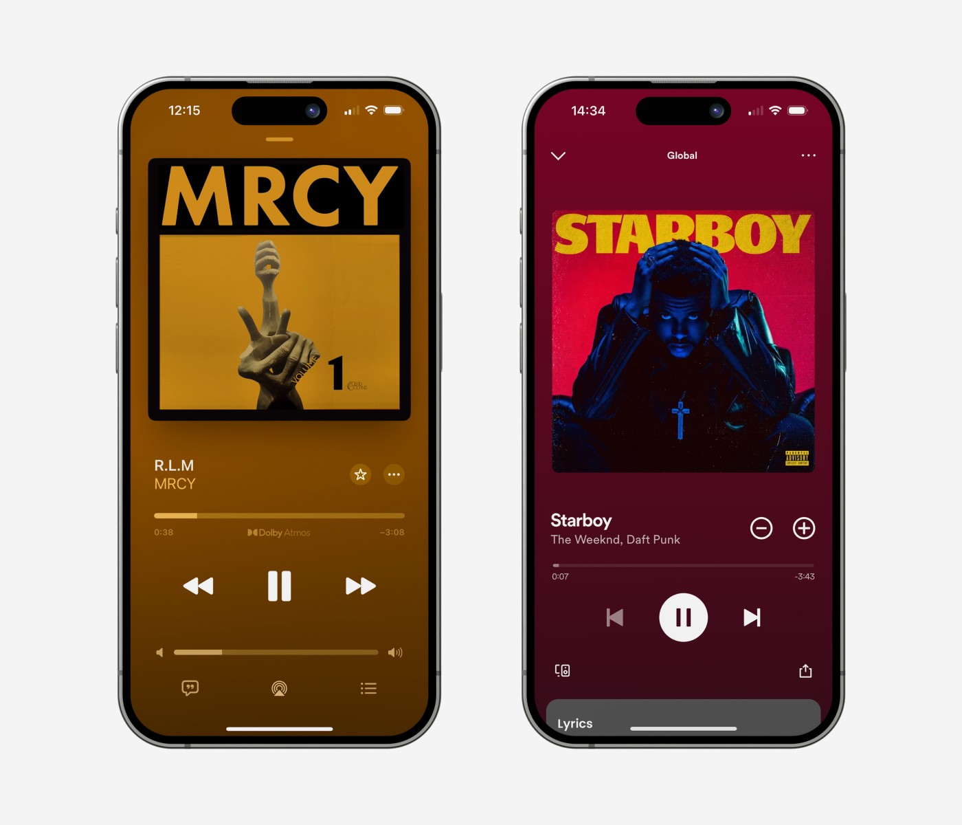
Visual comparison between the Apple Music Player and the Spotify’s one.
Personalizing User Experience Through Algorithms
Of course, there are other reasons for Spotify's recent success. It has been around as a reliable music app for over a decade, meaning it was able to amass a robust and loyal user base. Then, there was the straightforward UI/UX. That was also ahead of its time and made it easy for users to find the music they love.
On the other hand, Apple Music has undeniable brand recognition value. It has an equally rabid user base, an influential app developer team, and a quality product that markets itself.
Unfortunately, that is insufficient to take over Spotify's perfect user experience algorithm.
You don't have to dig too deep to find evidence, polls, and comments from people praising Spotify's 'Recommended Songs.' The app has a spectacular ability to match your musical taste perfectly. That is why Spotify is leading the streaming platform battle, with almost double Apple's user base.
Despite not being a design-first solution, optimizing your algorithm and content suggestions can skyrocket your app engagement. That is especially true for e-commerce stores and social media platforms. Here, personalized product recommendations through UGC (user-generated content) generate more revenue and custom-tailored content feeds that increase user engagement.
Let's look at a real-life example of leveraging an app algorithm through design.
Filtering Personalization With User Segmentation
As mentioned, you can detect and define patterns of engaged users by analyzing data and user behaviors.
Take a look at Audiomack as an example. It's a music streaming platform founded in 2012 that counts millions of daily users. What started as a generic music platform quickly branded into 'specialized' genres around Hip-Hop and Rap. The app developers understood that most users originated in the Americas and Africa. With this change, user engagement quickly spiked, defining a precise and personalized UI/UX design that cultivated a winning strategy.
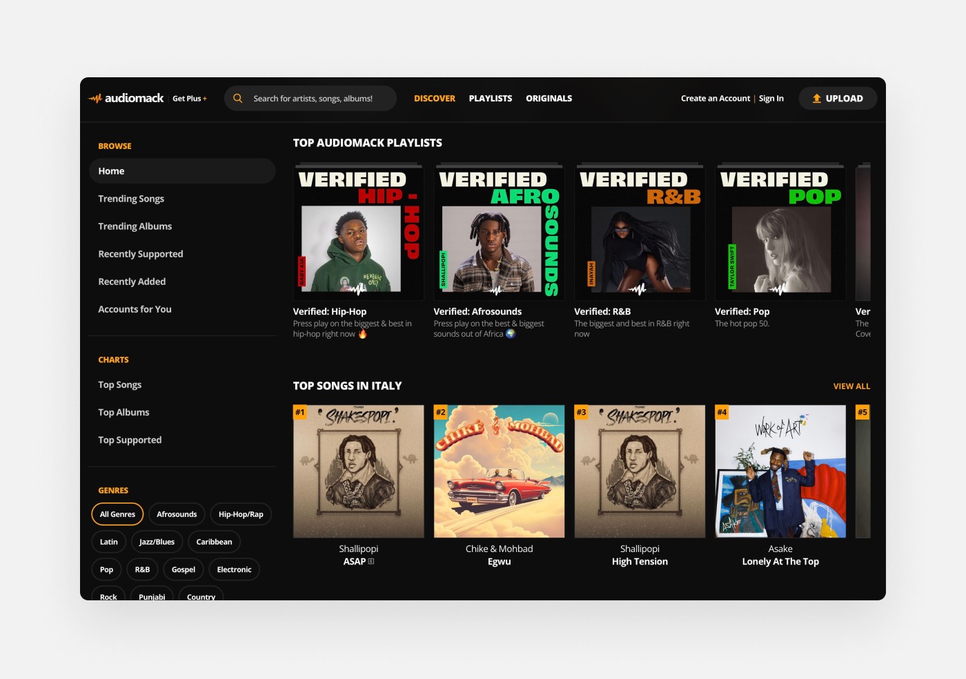
Algorithm personalization shown through the ‘Top Songs in Italy’ on the Audiomack web app.
Segmenting your users based on demographics, interests, geolocation, and other valuable data points can improve app engagement and bootstrap business success.
Applying Custom Themes for Personalization
Let's be honest—web browsers haven't been precisely tech trendsetters. They've been around forever, offering the (almost) same experience every time: different tools but the same results.
This lack of innovation is evident in the stable market share of Google Chrome browser, which dominates 65% of the market, followed by Safari at a distant 18%.
Yet, the Arc Browser changed that game in 2023. In under a year, this innovative browser quickly acquired hundreds of thousands of users (some say close to a million already). While PR campaigns have played a crucial role in its rapid rise, the real game-change lies in the browser's revolutionary features. Users remain more engaged due to customization capabilities, something no other noteworthy browsers currently leverage.
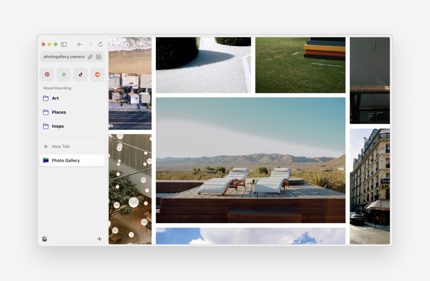
Screenshot of the Arc Browser featuring a moodboard of photos and a customizable lateral bar.
How Micro-interactions Grew a Viral Social Media Campaign
Not everything related to app engagement is left to significant, full-scale innovations. Sometimes, we're so focused on the bigger picture that we forget it is those tiny details that make all the difference.
Micro-interactions occur when the user performs specific tasks within your app. These could be subtle animations, sound effects, or even haptic feedback.
Threads, the X (previously Twitter) alternative platform launched in 2023, had one such successful engagement campaign in early 2024. That is when it introduced a playful confetti explosion whenever a user pressed the 'Like' button (which morphed into a dragon) on posts tagged with 'Lunar New Year.'
In no time, hundreds of posts started appearing on the platform, prompting people to 'like' them so users could witness the new animation. Many posts went viral as people repeatedly wanted to relive the same event. Such posts often reached over 10,000 likes in under 24 hours.
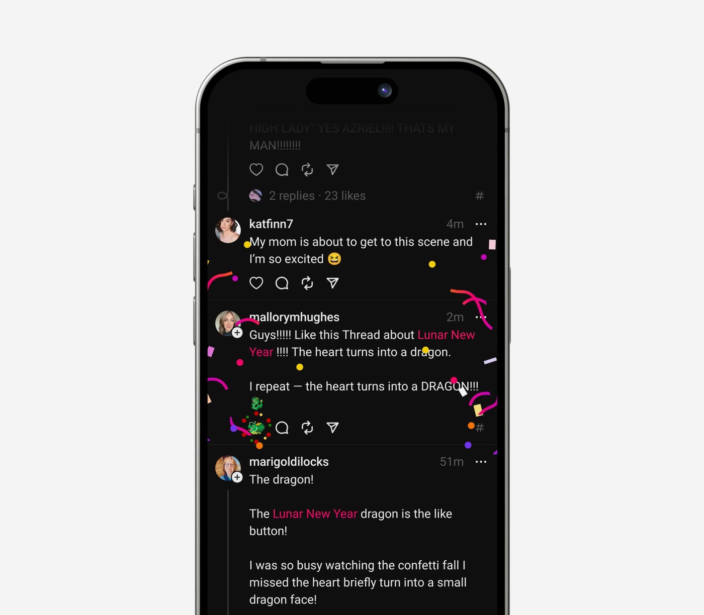
Screenshot of the moment when the user clicks on the ‘Like’ button. It turns into a dragon and the screen is flooded with confetti. Screenshot made by Robert Holland
After analyzing hundreds of Threads posts showcasing the campaign results, we generated a report with the 100 best-performing results. Here are the numbers:
The event had a lifespan of 10 days (It started on the 9th and ended on the 18th of February 2024)
The top 100 posts collected a total of 256,516 likes.
The average post got 2,541 likes.
The best-performing post got 13,514 likes.
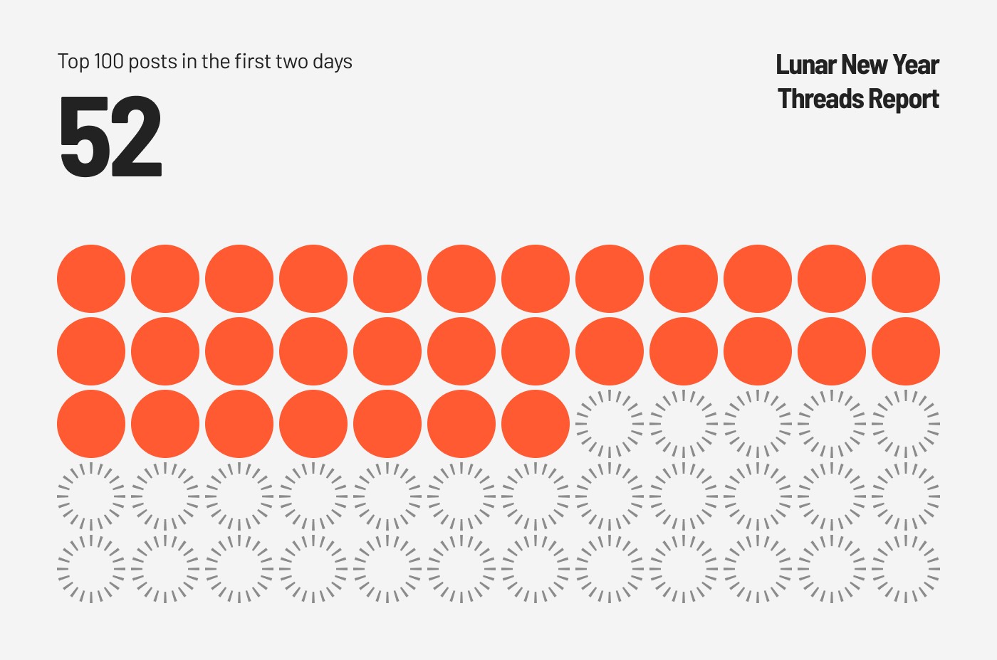
52 out of 100 posts happened in the event's first two days.
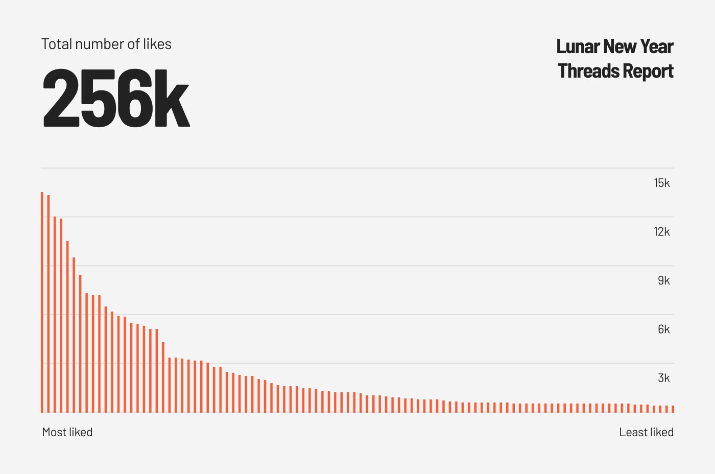
As you can see, there are some interesting statistics and considerations. Over half the top-performing posts happened within the first two days, demonstrating that most interactions happen quickly. Even so, people still interacted with the posts for the following eight days, but less frequently due to the slowing novelty of the surprise effects.
On the other hand, the post that collected the most likes came from a single user with more than 100,000 followers. Despite his more extensive user base, most of his 'normal' posts only received a few hundred likes. Even the author of this account pointed out the absurdity of how that specific post was his best-performing one to date.
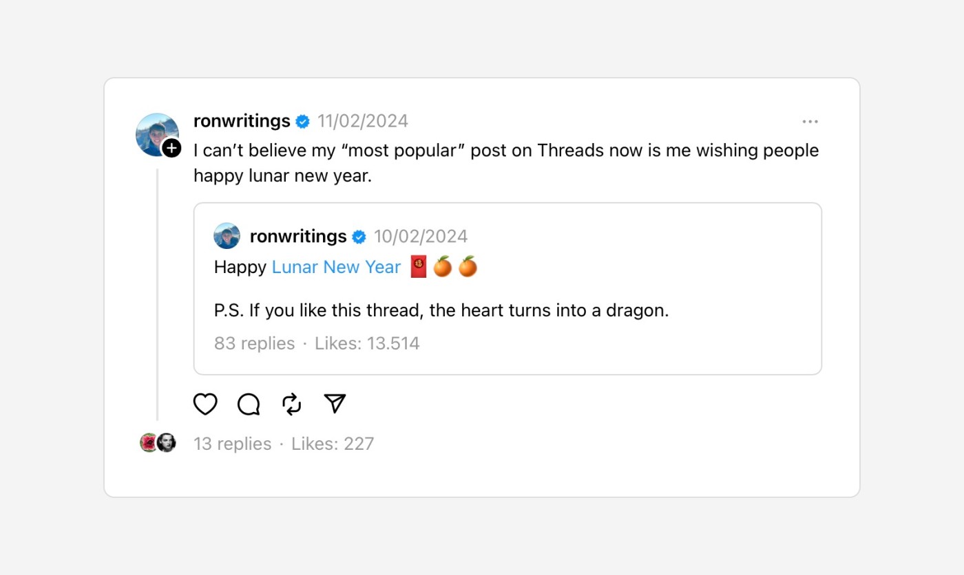
Screenshot of the best-performing Threads post with the Lunar New Year tag.
Since Threads is a closed app environment without public APIs, tracking down tags and the best posts is exceptionally challenging. We cannot make a one-to-one comparison between this app engagement campaign and regular day-to-day posts. However, just by looking at these numbers, you cannot deny that the Meta team applied a successful app engagement strategy.
You should tailor every campaign to your target niche and audience. For instance, that same strategy wouldn't be as effective if it applied to a trading app used by users in the 50-year-old or older demographic.
Addressing User Pain Points While Onboarding
When onboarding users to your app, you must avoid complex or confusing processes. These can quickly lead to higher churn rates, so it's critical to ensure the user instantly understands the app's intrinsic purpose and how to use it.
Onboarding helps set a user's expectations. It is your first chance to explain features your users will appreciate adequately. However, it is crucial that your onboarding continues after registration. You want to highlight tutorials now and then whenever you introduce new features. This way, users can experience and understand how to make the most of the latest features.
You should also have a tutorial library. That empowers users to re-watch tutorials whenever they feel stuck in the app flow or need a refresher course. Some suggestions include positioning such tutorials in a secondary menu, app settings, or the user's account.
An excellent onboarding approach is directly addressing the most significant user pain points. You can identify usability barriers that may lead to app abandonment or lower app engagement by running tests and listening carefully to feedback.
Gamifying the User's App Experience
While we're not big fans of the word 'Gamification,' it has become an industry standard. That is one of the most respected methods to boost general app engagement. It refers to the act of including structures, flows, and elements like scoring points, accomplishing badges, leaderboards, and user challenges that are reminiscent of games.
The Robinhood app is a successful example. This platform revolutionized the trading and investment world by creating an effortless and enjoyable user experience without catering only to senior citizens or professional investors.
Some key differences were, in fact, game-like experiences. Like 'Threads Dragon,' Robinhood also sprinkled confetti over the screen whenever a user successfully purchased a stock. Due to various additional tactics like competitive fees and simplified UX, it became trendy during global lockdowns in 2020. Suddenly, a large user base had the time to consider investing as a strategy for saving and building wealth.
However, after several legal and ethical backlashes, Robinhood removed many gamification attributes that made the app unique. Therefore, it is important to value every app as a standalone experience to determine which app engagement strategy will work best in the short and long term.
How UI Design Grows App Engagement
We quizzed people who currently work in our industry. Given the same functionalities, 9 out of 10 people would choose a better-looking app over an ugly one. Like it or not, UI design is crucial in maintaining high app engagement. This research demonstrates that users want to engage with pretty tools. A clean, modern UI makes interacting with your app an enjoyable experience. It drives users to longer session lengths and helps improve word-of-mouth mobile marketing.
Browse through the Google Play or Apple App stores. You'll see thousands of bad-looking apps lacking continuity in design and flow. Some may be outliers and earn popularity despite their looks, but that is usually by catering to or establishing a brand-new niche.
However, a well-established niche like the music industry or social media only works with a clean, attractive app design.
You must develop a well-designed app interface. It is a strategic move to boost your app engagement and help your company win against overwhelming competition.
Focus on Function Over Form
Although 9 out of 10 surveyed users picked a better-looking app, 10 out of 10 prefer a worse-looking app with superior user experiences. Prioritizing UX design is crucial to maintaining and growing app engagement. By creating intuitive, rich, and user-friendly experiences, you are improving your chances of success.
Several Threads posts note the platform's superior UI compared to X. Nevertheless, they mention a lack of essential functionalities, like the inability to 'Save for Later' or engage with Analytics. This lack of features makes users less likely to remain on the app long-term.
That is one of the most significant obstacles younger app designers face. Most prioritize aesthetics over functionality. But the more experienced they become, the more that mentality shifts—luckily, for the better.
In Conclusion
The power of design and learning how to leverage it to maintain and grow your app engagement is foundational to retention and conversions. Personalization, micro-interactions, custom event campaigns, aesthetics (UI), and usability (UX) allow you to target your audience better and address any pain points.
When you implement these design-focused strategies, you improve your app engagement levels. Instead of relying on noisy or flashy marketing tactics like push notifications or poorly trained chatbots, you provide the best user experience possible.
If you'd like to learn more about design in app engagement or require a small Design Team to help you improve your overall app user experience, contact us at matteo@pure9studios.com. You never know when a quick design fix is all it takes to transform your app's success.

Written by Matteo Della Chiesa
Matteo is a Freelance UI/UX and Web Designer with 10 years of experience working with agencies, startups and well-established companies. He had the opportunity to work for clients like Activision Blizzard, Adobe, CBS, Marvel, and Nickelodeon. He is a partner at Purenine Studios and a Designer at Convertri and ThriveCart. He started designing in Photoshop at 14, and graduated as a Graphic Operator and Advertising Graphic Technician.
